E-Locker System
- 2023年3月10日
- 讀畢需時 4 分鐘
已更新:2023年3月22日
2017 .CatchPower / SafteHouse.co
Creating an e-locker for Ecommerce and delivery system

Online shopping is not only just a fancy word anymore but into everyone's daily life. After mobile starts to take away most of time, online consuming becomes a predestined option and inescapable tendency.
Background
Before any food delivery starts hunting in Taiwan's restaurant industry, CatchPower (快取寶) was the first company that trying to put together the food delivery service and restaurant order service into an APP in Taiwan. CatchPower.co was a startup company and it was expanding extremely fast. Not over 6 months, we had more than a hundred employees and the CEO decided to split up each department and made them become independent companies. And SafeHosue.co was the tech development branch that mainly helping CatchPower software and mechanical evolution. I joined this project in 2015 which means there wasn't any Uber or panda on the street in Taipei. I had a great chance to participate in the early time and being the design lead in the UED team. And my first task was creating the design guidelines.
Challenge
First, it was a brand new concept and we didn't have references, and second, we didn't have much TIME to update, cause the new features kept publishing at that moment. So it's full of fun and waiting for us to explore.
Process & Result
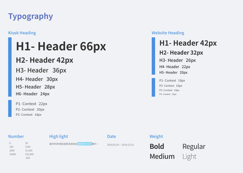
Like most startup companies, there was no rule, no instruction, or none manual for everyone to follow up. There is Nothing! Before I jumped into the project, all engineers in our team were deeply developing the app and websites by their own imaginations, which wasn't helping for the brand building. After I published the first variant of the design guideline, every site and commercial suddenly had consistency. For our PMs and the marketing team, that was also an exciting improvement because they finally can do the conversation with the development team. And the files below were the latest variant we had in CatchPower.co and we added the temperature label for the upcoming service.


Besides design guidelines, I was assigned to create the mockup and many user-flow for the upcoming features which were for our main eCommerce site.
I've been worked on the online refund service flow and it'd be for both website and App. And mostly, this service has to sign up and let our delivery team pick their goods back. As you can imagine, there were a lot of processes needs to be considered, such as invoice and E-locker arrangement.
After a long discussion with the development lead, we decided to cut it into two phases, one is The Refunding, and two is Picking up the Goods. Both were related and complicated. In the first step, we let customers leave their contact information for our customer services and let our CS arrange the locker ID, and put this case into the database. And the second phase, we want to make it become online self-refund progress and let our customers choose their free time to put the wrong or problem order box into our E-locker and let our people bring the stuff back. It was so inspiring that I had so many conversations with CS coworkers and some delivery members to understand their daily workflow and current refund process, such as where did they receive the issues and how does the information pass to the delivery team.

Delivery App for Internal Team
Preface
It was an internal apps operation project with the Tech team, and the product will be the main system for our delivery department.
Challenge
Be pointed as a project owner who needs to create all the operation documents and design specs, it was really a big task for me since I was still working on our main E-commerce visual design project at that moment. And why do we need this app? How were they currently working on the delivery each day? Aren't we already used a system for checking orders?
So for finding out the answer, I've worked with our two talented android app developers and before the task we've collected and asked so many questions from the back-end division.
Process & Result
The core of this app was very clear - create our own system and improve the current delivery process.
Sounds very simple but it's actually a big goal. Therefore, we tried as much as we can to gather information about the current way the delivery crews use, and luckily we received lots of feedback from them.
The logo design was my first task. After some concept brainstorm, I designed two variants. And the dumbo one was a big success. As you can see from the image below, there are 4 different colors for the ear and that means the temperature of each E-locker system. In the beginning, I tried to use labels and colors to mark the item lists and the feedback from our users was color is easier and faster to recognize.

Besides the visual design, we followed the lead of the delivery team and were experienced as a night delivery guy. It was tough to send packages in the dark night and we found out that our current system was too bright while checking up on the list just made our eyes burn.
" We get blind when every time open the list. " - says by company deliver
It sounds like a joke but it's a very important feedback that we ever heard. And start to focus on the dark mode way before iPhone working on it. But sadly before we start to working on it, it project has been canceled.
Clients: SafeHouse.co
Role: UI Designer, UX researcher Tool: Sketch, Zeplin, Photoshop, Illustrator Date: 2016 - 2017