PXPAYPLUS
- 2023年3月10日
- 讀畢需時 3 分鐘
2023 .PX Mart/ PxpayPlus.co.E-Payment
A simplified and No Touch’ retail shopping experience
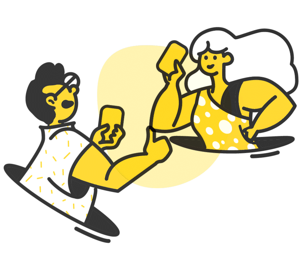
During the epidemic, interacting with people has become a very terrifying thing for everyone. But going out for grocery shopping and purchasing is still necessary. Therefore, PXPAYPlus is the solution for this unknown situation while in the grocery store. We are trying to help our users to avoid a lengthy checkout process and increased risk only for waiting in line.

One of the biggest local supermarket chains decides to boot their own membership app and expects to become the wallet of every Taiwanese.
PX mart was a government corporation that with cheaper prices and no sales tax whose access is restricted to the military, civil servants, and educators. Until 1988, the company was privatized and headed by Lin Ming-Hsiung. And when 2021, there are already over a thousand PX marts located in the whole country.
Great start
It's an incredibly tempting challenge for any designer to build a zero-to-one payment application. As it is my first time joining a huge development team and all the design thoughts and workflows are so different from my experience. When I joined, the concept was quite out of focus and the definition of the payment has been reversed many times. And it made me spend couple days on the research and case studies to clarify the possibility and the goal. At first, based on the analysis and our initial philosophy of the brand, I created 3 personas for the upcoming app. Unfortunately, the common design thinking isn’t for here.


Personas I've made for the upcoming product.
Big Challenge
At first, I suggested PXPAY Plus ban be based on the current membership app - PXPAY(全聯支付). The current user experiences could easily lead people to understand the new services. And by reforming the CI system from the headquarter, which is PX Mart brand, could be the fastest way to publish our product. Because the brand itself presents an advanced feature of the PXPAY.


Branding Design for the company.


Wireframes and GUI designs for the app.
But the stakeholders expected to have a younger brand and the target audience should be “ the petite bourgeoisie aged 25 to 30”. Therefore the UI style tends to be more simple or pleasing way and the color scheme can be close to blue and gold.
However after 6 months, because of the PR consulting, the brand core switched to another path. Our TA changed to only women who are between 30 to 45 and the color scheme changed to black and yellow. Which means we were going to switch everything. And that time, the UI became more “hipster” and I’ve asked to add more illustrations and animations to match the idea. In early 2022, the product core has been changed again because of the business strategy. We switched the TA to “ PXPAY members ” and expected to put the “mascot ” into our product with more hand drawing style.


Currently, the product hasn't been launched because of the decision from the headquarter. And we've been through a VERY big process of branding design.
It's a really exciting product that I've been working on and the experience of co-working with such a big developed team was very educated. I found that it's not easy to communicate when people didn't pay attention to the product goal.
Clients: PX Mart / PXPAYPlus.co
Role: Principal UI designer and UX consultant Tool: Sketch, Zeplin, Axure Date: 2020 - 2022 Site: Unpublished